Fohr Rebrand
The only constant is change and that’s never more real in a startup. After years of solid brand equity, it was time to update the look and feel of the brand and unify the site as a whole.
Project Overview
With branding that felt outdated and out of place in the data-focused tech world, Fohr needed to reinvent itself. What initially started as a name and logo change quickly evolved into an entire new look for the company. The rebrand encompassed everything from a new name, to a new logo, brand new marketing and sales materials to an entirely new marketing website.
My Role
As the Lead Product Designer at Fohr, I was responsible for the oversight of all design decisions. I worked closely with the very talented Vincent Fileccia (who was responsible for many of the rebrand elements) to make sure that brand standards were carried out over every aspect of the company.
The Basic Elements
After agreeing on the new logo, typeface (Plain by Optimo Type Foundry) and color palette, we built the new elements of the brand.


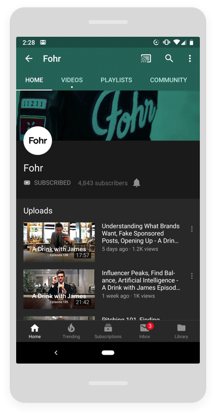
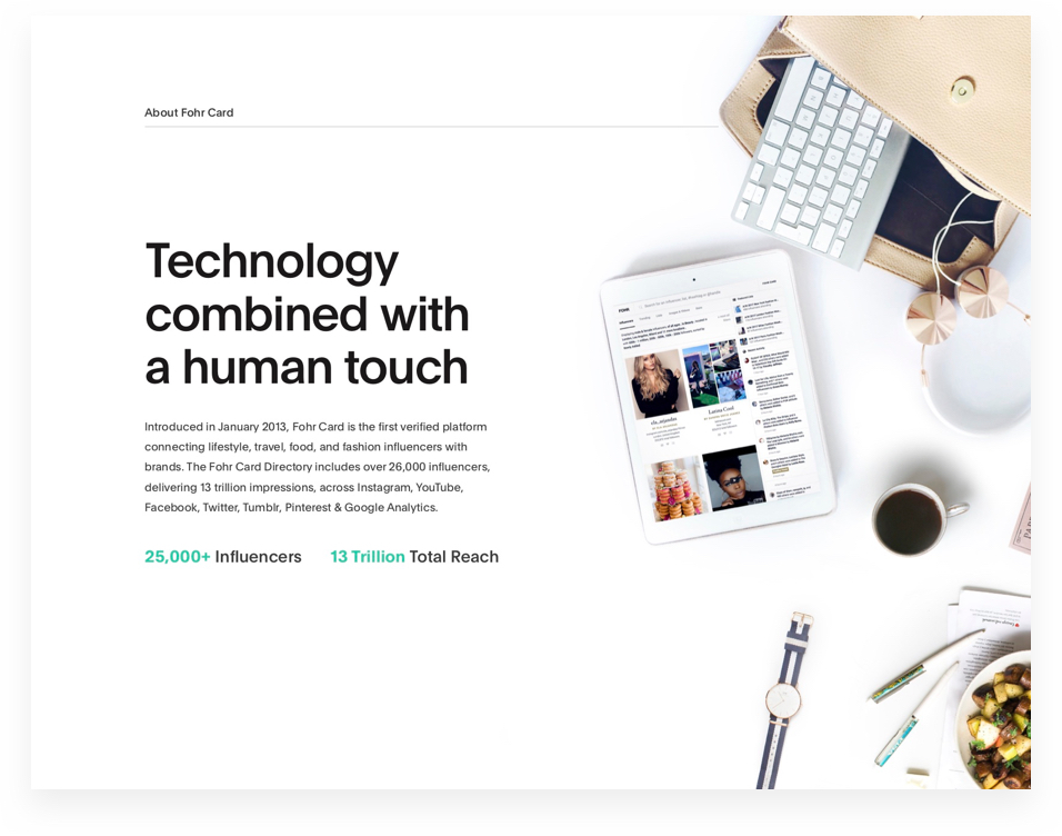
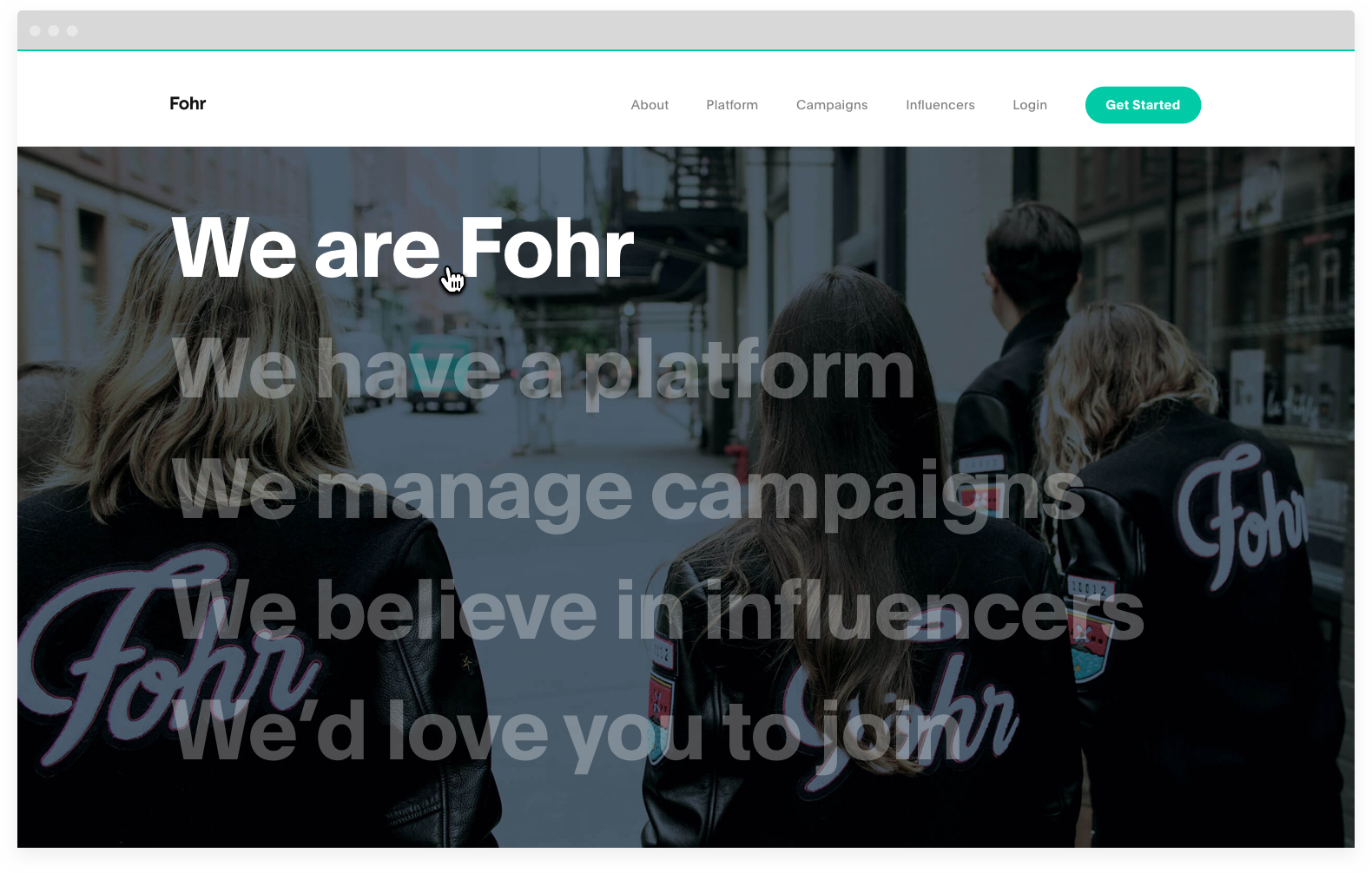
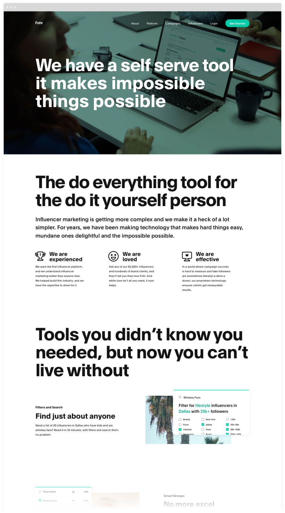
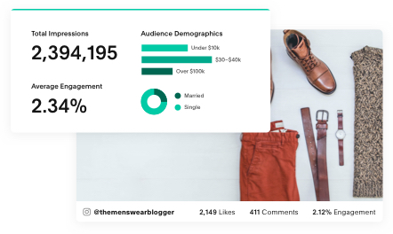
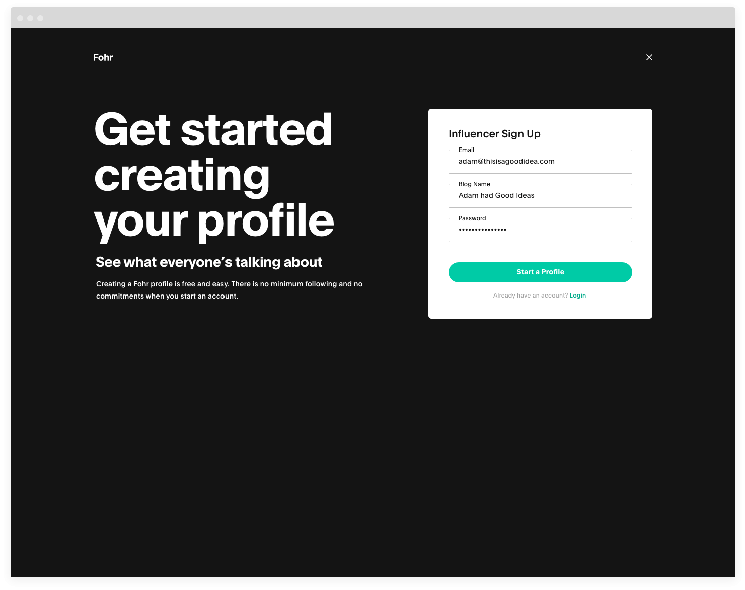
Fohr.co Marketing Site
A large part of the rebrand was a new website, Fohr.co. After a few rounds of experimentation, we ended on a bold new direction.